Mobile Website V.S Responsive Websites
The Pros And Cons Of Responsive Web Design Vs. Mobile Website Mobile website or responsive website: the short answer A mobile website is a separate, smaller version of your site built only for phone screens. A responsive website is one…
On this page
The Pros And Cons Of Responsive Web Design Vs. Mobile Website
Mobile website or responsive website: the short answer
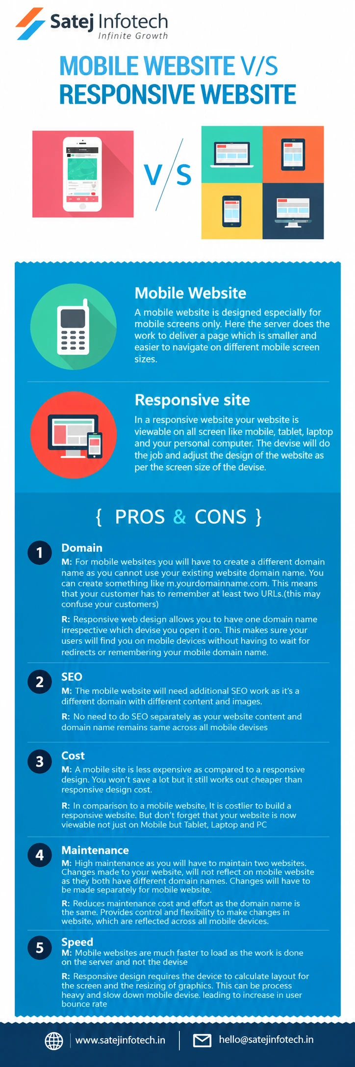
A mobile website is a separate, smaller version of your site built only for phone screens. A responsive website is one website that rearranges itself to fit a phone, a tablet, a laptop or a desktop screen. The infographic above compares the two on five points. Here is the same comparison in plain text, with a note on where things stand today.
Mobile website
With a mobile website, the server prepares a page that is smaller and easier to move around on a phone. It is made for mobile screens only, so visitors on a laptop or desktop still see your main website.
Responsive website
With a responsive website, the same pages are viewable on every screen. The browser adjusts the layout to the size of the screen, so you build and maintain one site, not two.
The five points compared
1. Domain
A mobile website usually needs its own address, such as m.yourdomain.com, and your customers may have to deal with two addresses. A responsive website uses one domain on every device, so nobody has to wait for a redirect or remember a second address.
2. SEO
A separate mobile site is a second site with its own content and images, so it needs its own SEO work. A responsive site keeps the same content and the same address on every device, so you optimise once.
3. Cost
A mobile website costs less to build than a responsive one, though the saving is not large. A responsive website costs more up front, but it works on mobile, tablet, laptop and desktop.
4. Maintenance
Two websites mean two sets of updates. A change made to the main site does not appear on the mobile site until someone makes it again. With a responsive site, one change shows up on every device.
5. Speed
A mobile website can load faster because the server does the work. A responsive site asks the device to work out the layout and resize the images, which can slow down a phone and raise the bounce rate if the site is heavy. Well optimised images and clean code keep a responsive site fast.
Which one should you choose?
For most businesses today, a responsive website is the better choice. You maintain one site, you do SEO once, and your customers get the same address on every device. A separate mobile site mainly makes sense for a very specific need, and it brings the extra upkeep described above.
If your current website does not work well on a phone, talk to us about website design and development. We can tell you whether it needs a redesign or a few fixes.
Contact us today to discuss your requirements.